ChromaStick Iron Brush Buiko
ChromaStick
A Tool for Precise Color Matching
Have you ever wondered why painters don’t simply compare color by holding a brush with paint on the same line of sight as the subject?
Just like designers, restorers, printers, or colorists — anyone who has the ability to place two colors side by side.
It seems logical and convenient.
In fact, artists of all eras have consciously or instinctively tried to match color directly.
However, such attempts have proven ineffective for two reasons: the lack of a simple and stable tool for comparison, and the lack of understanding about the need to synchronize the lighting between the paint and the subject.
Without these conditions, this method loses its meaning.
On this page, I would like to introduce a tool for accurate color matching — the Chromastic.
A short overview of the tool is available here.
Chromastik is a specialized palette knife for precise color work using the direct comparison method.
Unlike a regular palette knife, it allows you to adjust the exposure — to change the illumination of the blade by turning it toward or away from the light source.
This helps synchronize the lighting on the paint with the lighting of the subject and significantly expands the tonal range available to the artist.
Each measurement remains stable thanks to a special locking mount and the gravitational balance of the handle. These elements hold the blade in a strictly defined position. With every comparison, it returns to exactly the same spatial orientation.
This design ensures delicate, precise color work and gives the artist the ability to consciously transform the natural color into a more expressive, artistic one.
ChromaStick (from the Greek chroma — color, and stick) is a special palette knife with adjustable exposure, designed for color matching. This versatile tool allows you to mix paint on the palette and make direct comparisons with the subject.
Chromastick is adjusted for exposure and maintains the stability of each measurement throughout the entire session.
The tool is intended both for precise color matching and for artistic reinterpretation of color.
Before starting work, the artist adjusts the angle of the tool’s blade to match the lighting conditions (more on this below), mixes an approximate shade on the palette, and immediately compares it with the subject using direct comparison
If needed, the color is adjusted right away — until it fully matches.
Adjusting exposure when matching color in different situations — from working with a photograph to painting outdoors.
(The video is in Russian, but the subtitles match the Russian text exactly.
You can turn on subtitles or use YouTube’s automatic dubbing in your language)
(The video is in Russian, but the subtitles match the Russian text exactly.
You can turn on subtitles or use YouTube’s automatic dubbing in your language)
A short overview of the tool
Detailed overview of the tool
(The video is in Russian, but the subtitles match the Russian text exactly. You can turn on subtitles or use YouTube’s automatic dubbing in your language)
(The video is in Russian, but the subtitles match the Russian text exactly. You can turn on subtitles or use YouTube’s automatic dubbing in your language)
The ability to place the paint sample directly on the same line of sight with the subject and compare them side by side greatly simplifies the process of color selection.
Even a small difference in color becomes very noticeable, because both colors are seen next to each other, at the same time.
Try a simple experiment.
Choose a color from life — not the most obvious or vivid one, but something subtle and muted, like most colors in the real world.
For example, the color of human skin or the shadow cast by an object on a wall.
Match it using your usual method, carefully and slowly, aiming for maximum accuracy.
Once you think you've got it, apply the color to a flat surface (a palette knife or a strip of paper) and compare it directly with the object.
Even if you are an experienced painter, you’ll likely be surprised at how different the colors appear.
This simple experiment clearly shows how much our perception of color can differ from reality.
We perceive color only by comparing it with surrounding colors.
The brain never sees a color “in isolation” — it always evaluates how much lighter, warmer, or more saturated it is relative to what’s around it.
This is the foundation of how we see color.
That’s why, when two colors are placed side by side, comparison becomes much easier — and this is exactly what the method is built on.
Direct color comparison is a way to bypass the limitations of human perception.
It allows the painter to “switch off” the brain’s automatic color interpretation mechanisms.
When placed on the same line of sight, the paint sample enters the same environment and falls under the same influence of simultaneous contrast as the object itself — into the same “color environment.”
This creates equal conditions for both colors, allowing the eye to compare them more objectively.
Stability as a Necessary Condition
The essence of the direct comparison method is to place the paint sample on the same line of sight as the subject and see both colors side by side, at the same time.
To ensure accurate comparisons, the paint sample must be placed on a flat surface.
Even a slight change in the angle or tilt of this surface relative to the light source can significantly alter the perceived lightness of the paint.
That’s why it is essential to maintain a stable position of the surface during each color check — the plane with the paint sample must return to exactly the same position as in the previous comparison, receiving the same amount of light every time.
Without stability, it is impossible to make accurate adjustments to the paint color, because each subsequent comparison would take place under different conditions.
The artist must be certain that after each correction, the sample is placed back into exactly the same conditions — in order to clearly see how the adjustment has affected the color.
Moreover, each new shade in the painting must be found under the same consistent conditions as the previous ones.
Only this way can correct color relationships be established between all elements of the painting.
Like laying bricks one by one, all the key colors in the work must be assembled carefully and patiently.
Typically, this comes down to about 10 to 20 essential tones.
The stability of the proposed tool ensures the consistency and repeatability of comparisons.
The adjusted and fixed rotation of the paddle toward the light source, along with the vertical alignment of the handle, creates identical exposure conditions for each comparison and color adjustment.
This stability is maintained throughout the entire painting session.
The adjusted and fixed rotation of the paddle toward the light source, along with the vertical alignment of the handle, creates identical exposure conditions for each comparison and color adjustment.
This stability is maintained throughout the entire painting session.
Adjusting the Tool for Light Intensity (Exposure)
A key feature of the tool is the ability to adjust the angle of the blade’s surface for exposure.
Throughout history, painters have sought to match color directly, but they have consistently encountered a fundamental problem: a mismatch in lighting between the paint and the subject.
Without synchronizing the illumination, the painting would turn out either too dark or too light, and direct comparisons became meaningless.
Exposure adjustment solves this problem.
By controlling the light intensity on the paint, the artist can synchronize the lighting of the paint with the lighting of the subject — even if they are in different lighting environments.
Artists rarely work in ideal lighting conditions — such as a steady overcast day outdoors, when the lighting on the paints and the subject is nearly identical.
Much more often, they work in situations where the lighting on the palette and the subject differs significantly.
Let’s say an artist is painting a still life.
They are positioned near a window in the studio, while the still life setup is located slightly farther away.
As is well known, illumination doesn’t just decrease with distance — it decreases by the square of the distance.
This means that if you double the distance from the light source, the light intensity drops by a factor of four.
Triple the distance — and it drops by a factor of nine.
Even a small difference in distance can lead to a large difference in brightness.
If this lighting difference is not compensated for, then during direct comparison the artist will automatically transfer that difference into the painting.
If the finished painting is then brought up to the subject, it will look significantly darker than the original.
And the opposite is also true:
If the subject is more brightly lit than the artist’s working area (for example, by a strong lamp), the paints will appear darker than the subject.
If the difference is not compensated, the artist will be forced to lighten all the paints during comparison — and the painting will end up too pale and washed out.
Example with paper — three sheets placed at equal intervals of 1.5 m from the window.
Rotating a sheet of paper compensates for the difference in illumination.
In the same way, by rotating the plane of the tool’s blade and adjusting the exposure, we can control the exposure of the entire work—or of its individual areas—to a very wide extent.
For example, with such a rotation of the blade, the deepest shadows of nature will not turn into dead black patches.
(Learn more about fixed and dynamic exposure here)
Adjusting the exposure of the tool allows the artist to synchronize the illumination of the paints and the subject, even if they are under different lighting conditions.
Before starting work, the artist should place clean white paint on the Chromastick and compare it with the brightest part of the subject (or place a sheet of paper next to the subject). Then, by turning the blade of the tool toward or away from the light source, the brightness of the white can be adjusted to approximately match the tone of that brightest area.
Before starting work, the artist should place clean white paint on the Chromastick and compare it with the brightest part of the subject (or place a sheet of paper next to the subject). Then, by turning the blade of the tool toward or away from the light source, the brightness of the white can be adjusted to approximately match the tone of that brightest area.
By rotating the brass sleeve, the plane of the blade can be precisely fixed at a certain angle to the light source (for example, to a window), thereby adjusting the required light intensity.
(The brass sleeve of the tool has an internal thread and fits tightly onto the handle).
(The brass sleeve of the tool has an internal thread and fits tightly onto the handle).
After the adjustment, the artist can immediately begin working: mix the required shade on the palette and directly compare it with the color sample. If necessary, the shade is corrected until it fully matches or is altered in an artistic direction based on the color of the object.
Moreover, by adjusting the exposure, the artist can consciously control the overall tonal range of the painting — or of specific areas within it.
For example, if the blade of the tool is turned toward the light, the painting will ultimately come out darker.
In that case, the paints will appear brighter during comparison — and you will automatically have to darken them to achieve a match, because the paint is receiving more light than the subject.
Conversely, if you reduce the amount of light hitting the tool by turning it away from the light source, the entire painting will come out lighter.
Here, a simple inverse rule applies:
more light on the tool — darker painting; less light on the tool — lighter painting.
It is important to note that if the artist’s working area is less illuminated than the subject of the painting, direct comparisons will not allow accurate tone matching. There will not be enough light on the tool, and the paint will appear darker than it should. There must be at least as much light on the paddle as on the subject of the painting. The artist’s working area and the painting itself, however, may be located in the shade.
(Learn more about fixed and dynamic exposure here)
This technique can be controlled, even within a single work. It is especially relevant when working outdoors. Objects in nature are three-dimensional, and if we literally match the shadow areas, the painting may turn out too dark.
When working with shadows, it is necessary to lower the exposure of light on the tool (turn it into the shade). This way, when selecting colors for the shadows, you will automatically have to lighten them slightly.
The same applies to areas of nature that are too bright. When working with such areas, you can set the blade of the tool directly toward the light, and during comparison you will automatically need to darken the paints a little.
This approach makes it possible to keep the middle tones consistent with nature, while avoiding blackness and loss of detail in the shadows, as well as overexposure in the bright areas. (More details in this video).
So, a stable exposure setting adapted to the specific lighting situation is essential — and fundamentally important.
A consistent vertical position, along with a precisely adjusted and fixed rotation of the blade toward the light source, ensures a systematic approach to comparison.
It creates equal conditions for each measurement throughout the entire session, making it possible to achieve high accuracy in color matching across different areas of the subject.
Maintaining consistent conditions for each measurement allows the artist to build up tonal and color relationships across different areas of the subject in a clean and controlled way — without muddiness or corrections on the canvas.
How to Use the Tool
First of all, the tool must be adjusted for exposure before use.
This means compensating for the difference in lighting between your workspace and the subject.
This is done by adjusting the fixed angle of the blade toward or away from the light source. This was written earlier.
Once the exposure is set, you can start working — mixing paint and directly comparing it to the subject.
The vertical position of the paddle is not accidental — it reflects the way paint lies on the surface of a painting.
This orientation is convenient not only for comparison with the subject, but also for matching colors directly to the painting itself.
This orientation is convenient not only for comparison with the subject, but also for matching colors directly to the painting itself.
In addition, the vertical orientation of the paint on the tool minimizes the influence of overhead light sources — such as the sky, sunlight, white ceilings, or indoor lamps — to which the glossy surface of oil paint is especially sensitive.
On the palette, the ChromaStick can be used with either side of the blade, which is very convenient during mixing.
After mixing an approximate color on the palette, you can immediately compare it with the subject and quickly adjust it in the desired direction.
At the same time, it is important to understand — the purpose of the tool is not limited to simply “hitting the exact color.” Chromastick gives the artist a solid reference for deliberate work with color — the ability to intensify, shift, or simplify it according to intent, while remaining confident that the starting point was correct. Changing the color then becomes not guesswork, but a precise decision based on a real sample.
When comparing color, the tool is lightly held between two fingers using the special cutouts in the brass sleeve.
Do not grip the sleeve tightly — this allows the tool to settle into a perfectly vertical position.
Do not grip the sleeve tightly — this allows the tool to settle into a perfectly vertical position.
The tool is always held in the same position, with the special marker — a hole in the collar — facing the artist and centered.
The hand quickly memorizes this position, ensuring that each comparison is made under consistent conditions.
The wooden handle acts like a plumb line, maintaining a constant vertical alignment.
And the consistent rotational angle of the paddle relative to the artist provides stable exposure.
Together, these factors ensure the consistency and repeatability of comparisons.
There should be little paint on the blade of the tool for comparison, and the surface of the paint should be flat and not glare. The neutral color of the steel blade has no colored undertone and does not affect the shade of the paint.
We place the Chromastick next to the selected area of nature, compare and adjust the shade to the required degree of similarity or slightly change it depending on the task.
Keep in mind that the exact color you find is just raw material; it can and should be adjusted to suit the style and the task.
We place the Chromastick next to the selected area of nature, compare and adjust the shade to the required degree of similarity or slightly change it depending on the task.
Keep in mind that the exact color you find is just raw material; it can and should be adjusted to suit the style and the task.
When comparing, I recommend looking with one eye — and focusing only on the blade with the paint.
Keep the subject slightly out of focus.
This helps avoid getting lost in small details and allows you to capture the overall color tone of the area.
It’s an important point.
I also recommend that you always take measurements at arm's length. If you take measurements too close, your eyes may become tired from frequent comparisons.
It is also important to determine which eye you will use for comparison. Many people experience differences in eye vision as they age. When making comparisons, it is advisable to use the eye that sees at arm's length with the highest level of clarity.
For example, let’s say you need to capture the color of a patch of grass, a patterned background, or hair in a portrait — all areas filled with small details and subtle variations in tone.
If you look at such an area with one eye, keeping only the paint on the tool in focus, the background elements will soften slightly (an effect caused by lens accommodation in the eye).
This makes it easier to capture the general color and value of the area, without breaking it down into distracting details.
This is a very important skill for a painter.
A flat paddle on a straight handle is much more convenient for working on the palette, since it is essentially double-sided.
This makes it easy to wipe off excess paint from the back side.
It’s an important feature for working quickly with mixtures and also helps reduce paint waste.
This makes it easy to wipe off excess paint from the back side.
It’s an important feature for working quickly with mixtures and also helps reduce paint waste.
In addition, the pointed tip of the paddle allows you to take precise amounts of paint for fine color adjustments.
The asymmetrical shape of the paddle of the tool was specifically designed for versatility.
It works equally well on different surfaces: the straight edge is convenient for handling paint on the firm surface of the palette, while the rounded side is better suited for working on the more flexible surface of the canvas.
The oval side of the paddle can be used both to apply and to remove paint from the canvas without leaving noticeable scratches.
The long handle allows the artist to avoid touching the paint on the palette or canvas with their hand, and also makes it possible to make broad, sweeping strokes.
If your paintings are usually small in size, the tool can be easily shortened.
This increases its maneuverability.
More on how to shorten the ChromaStick can be found in this short video.
This increases its maneuverability.
More on how to shorten the ChromaStick can be found in this short video.
The straight shape of the tool, unlike the curved form of a traditional palette knife, is much more intuitive and natural for hand movement, making it more comfortable to use on the palette.
Unlike a regular palette knife, which can only be held in one way, the ChromaStick can be held in various positions — close to the base or farther back, with a pen-like grip or a wrist grip.
It rotates easily in the hand, works with both sides, and is as flexible in use as a brush.
All of this adds variety to your working technique and complements the traditional palette knife when handling paint.
It rotates easily in the hand, works with both sides, and is as flexible in use as a brush.
All of this adds variety to your working technique and complements the traditional palette knife when handling paint.
With a bit of practice, the tool can be used like a kind of metal brush.
The flexibility of the paddle has been carefully calibrated — it is not overly stiff, and has enough spring to make working on both the palette and the canvas comfortable.
The flexibility of the paddle has been carefully calibrated — it is not overly stiff, and has enough spring to make working on both the palette and the canvas comfortable.
The paddle of the ChromaStick can also be used as a micro-palette for precise work.
Directly in front of the desired area on the painting, you can use a brush to mix fine color adjustments right on the paddle — with almost surgical precision — to match even the subtlest nuances in your painting.
This technique is especially useful for finishing touches in portrait work.
(In my line of tools, there is a dedicated micro-palette designed specifically for this kind of fine work. See my website and additional videos for more information.)
Main Use Cases for the Tool
At the beginning of a painting, just a few thoughtful and accurate color measurements are enough.
It’s important to establish the main tonal relationships and a few key base colors from the subject.
After that, the work can be continued confidently — even without further comparison — as long as you stay within those relationships.
Once all the main color spots are established, it becomes difficult to make a mistake — any inaccurate color will immediately stand out from the overall structure.
Even if the lighting changes — for example, if the sun comes out or it gets darker — you’ll be able to continue working accurately.
Especially if your base mixtures are still on the palette and haven’t been used up.
Working from Life in the Studio
Working in the studio is simple — the paints and the subject are usually in roughly the same lighting.
If any changes in lighting occur, they usually affect both the paints and the subject equally.
Once we have matched the white to the brightest areas of the subject, we can begin painting — color can be compared almost directly.
The capabilities of our paints are sufficient to match all the colors of the subject (there are exceptions for highlights and very deep shadows, but these can be handled by lowering or raising the tonality of those areas — more about dynamic exposure is explained here and in this video)
The exposure adjustment of the tool gives the artist one more important option: they can consciously decide whether the entire work or specific areas will be dark, like the subject, or bright, if that is the intention.
If the tonality of the nature you are painting suits you - set the white paint to the white of the subject until they match exactly.
Then the whole work will come out in the same tonality
in which you actually see the object of painting from your position.
If you want it lighter – darken the blade.
If you want it darker – lighten it.
Painting in Sunlight
Work in sunny weather presents quite a difficult task for the artist. This is due to the colossal tonal range given by the sun.
Our world is three-dimensional, and on volumetric objects light is distributed extremely unevenly: one side can be dazzlingly flooded with sunlight, while the other is immersed in deep shadow.
The tonal difference between the brightest surfaces facing the sun and the deepest shadows in secluded places easily reaches proportions of 10,000:1 or more. This creates a huge tonal range that our painting, being a flat, two-dimensional surface, simply cannot reproduce.
It, unlike a volumetric tree or bush, cannot simultaneously have areas brightly illuminated by the sun and areas immersed in the deepest shadow.
But thanks to the controlled adjustment of the instrument’s exposure, it is possible to significantly expand the tonal range of paints to match nature in comparisons. Instead of fixed exposure, we are forced to use dynamic, adjustable exposure.
For this, the lighting on the instrument must be adjusted to the illumination of the specific area of nature. The blade is turned until the paint sample on it falls into the same tonal range as the object of comparison.
To select the color of shadows we lower the light exposure on the blade to the maximum. In such conditions, the paints on the instrument will appear significantly darker.
At the same time, the desired effect occurs — in order to achieve a match with the shadows of nature, the artist will automatically have to lighten the paint on the palette, which makes it possible to avoid creating dull, "black holes" in the shadows.
When we make comparisons with the brightest areas of nature, we set the plane of the blade of the instrument with paint as much as possible towards the sun.
The color and saturation of midtones are sought in the interval between the extreme values.
The brighter the object we are painting, the more light should fall on the blade. And vice versa.
The practical order is as follows: the artist mixes an approximate tone and an approximate color for the selected area on the palette. Then he brings it on the blade to nature and by turning the plane selects such an illumination under which the sample tonally fits into the right place. At this moment it is possible to compare color and saturation and bring them to the required values.
It is important to emphasize — in plein air the method of working with direct comparisons remains compromise. Dynamic exposure makes it possible to accurately compare color and saturation, while the tonality of each area is selected by the classical method on the palette and then refined in the painting.
(more about dynamic exposure here)
When painting outdoors, it is important to consider the nature of the lighting.
When we work on plein air during hours of pronounced colored illumination — in the morning, in the evening, at sunset, or even in the shade of greenery — everything around is tinted with a common hue. Most often it is warm: yellow-golden, orange, amber.
This light falls both on the landscape and on the paint — whether it is on the palette or on the edge of a comparison tool. As a result, the eye compares not the actual colors, but those illuminated by this dominant tone. For example, under sunset light a white wall appears yellow, and we pick a paint that “matches.” But both the wall and the paint at that moment are bathed in the same warm light. Later, when we look at the study under normal daylight, everything appears dull, gray, without that golden atmosphere. The study needs to be corrected.
This effect arises not only when working by the method of direct comparison — the same happens when working “by eye.” It is not a flaw of the method, but a general property of colored light: it deceives both the eye and the paint at the same time. Experienced artists are aware of this trap and deliberately reinforce the dominant hue under such conditions.
Conclusion: in conditions of pronounced colored illumination it is necessary to consciously intensify its dominant hue in order to preserve the impression of color when viewed in neutral lighting. This applies to all methods of painting — both direct comparison and working “by eye.” Simply put — if you see yellow, make it more yellow. If you see pink, add more warmth. Only then can you preserve the sensation of light when the work is later seen in a neutral environment.
Working in Cloudy Weather
Working en plein air on a cloudy or overcast day, we must choose a bright spot for the workplace. There should be no lack of lighting. It is important that there is an open space to the sky behind or to the side (when choosing a painting spot, it is useful to carry a white sheet of paper to find a place where the light on this paper will be sufficient in comparison with the brightest areas of nature).
As when working in the sun, the exposure of the instrument must be adjusted to the brightness of the area being compared.
For painting the brightest areas — we set the plane of the instrument as much as possible toward the light. In this case, we can easily capture with our paints all tonalities, except for the white of the sky or some bright highlights.
Since paint cannot compete with such objects, the brightest spots of nature will have to be painted one or two tones darker, which is natural for competent painting.
For painting the shadow areas — we lower the exposure on the plane of the blade as much as possible, that is, we turn it into the shade. In this way, the shadow areas will not appear too black in the painting.
The color and saturation of midtones are found in the middle range.
Also, as when working in the sun, manual adjustment of tonal relations directly in the study is indispensable. However, the shade and saturation of color can be captured almost unmistakably.
It is important to note that if the artist’s workplace is less illuminated than the object of painting (for example, located in the shade), then direct comparisons will not allow accurate selection of the color shades of the brightest areas. The plane of the instrument must receive as much or more light than the subject of painting.
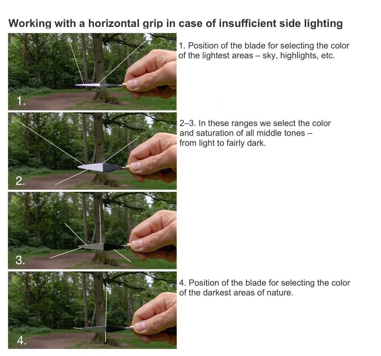
Sometimes there is insufficient side lighting at the chosen painting spot – for example, in a forest or a tree-lined path, where there is only overhead or backlighting. In such cases, the horizontal grip of the tool helps. More details in this short video.
This video shows the specifics of working en plein air with insufficient side lighting.
(The video is in Russian, but you can turn on subtitles – they are verified and accurate in your language)
(The video is in Russian, but you can turn on subtitles – they are verified and accurate in your language)
Important Note
It’s not recommended to place the ChromaStick directly against very bright areas of the subject during comparison — for example, a glowing white cloud in the sky.
Backlighting can make the sample appear dark, even if the paint is actually light.
It’s better to compare colors for such areas not directly but nearby — or to use your other hand as a shadowing background to block excess light.
This approach works well both when working from life and when comparing colors on a computer screen.
And one more thing — if nature is extremely high-contrast, there is a proven solution: you can photograph the subject and work in the studio from the photograph or from a computer screen, using the instrument with regular fixed exposure. Under these conditions, our palette can reliably and accurately cover the entire tonal range of the scene, since the photograph or screen compresses the full tonal range to an acceptable level for working with paints.
Working from a Screen
When working from a tablet, phone, or computer screen, it is important to disable auto-brightness and any other settings that automatically change the screen color. You should also adjust the screen brightness so that the pure white of the image is not lighter than the white paint placed on the Chromastick.
When working from a screen, it is important that the lighting in the room remains more or less stable. The screen maintains a constant brightness (with auto-brightness disabled), but the paint sample reacts to changes in the room lighting and shifts its tone. Because of this, any changes in lighting can cause discrepancies during color matching.
When working from a screen, it is important that the lighting in the room remains more or less stable. The screen maintains a constant brightness (with auto-brightness disabled), but the paint sample reacts to changes in the room lighting and shifts its tone. Because of this, any changes in lighting can cause discrepancies during color matching.
The white on the screen may have a slight bluish cast — that doesn’t matter — but it must not be brighter than the white paint on the ChromaStick.
When this condition is met, your paints can easily cover the full tonal range of the image.
However, it’s also important to remember: when comparing with the brightest parts of the image, it’s better to place the sample nearby rather than directly over them — to avoid backlighting that can make the sample appear darker.
Working Directly with the Painting
One of the most useful features of the tool is the ability to precisely match color from the palette — for example, when painting from imagination or during the final stages of a work.
Color matching from the palette is also relevant when working from life — once the main color relationships of the subject have already been transferred to the canvas and the goal is simply to refine the painting within the existing structure.
In all these cases, the tool must be adjusted to match the plane of the painting.
If your canvas on the easel is not perfectly vertical — which is often the case — the ChromaStick must be re-adjusted.
For instance, if the canvas is tilted and catching a lot of overhead light, you’ll need to balance the amount of light hitting both the canvas and the vertical surface of the tool.
To do this, apply any paint mixture to the canvas and — using that same color on the paddle — rotate it toward or away from the light source until both appear equal in value.
Once they match, you’ll be able to accurately judge how any mixed color on the palette will look on the painting surface, whether it needs adjustment, and where on the canvas it will best fit.
This is a very important feature of the tool: it allows the artist to immediately see whether the paint needs to be corrected, and where it fits best within the work.
Used this way, the ChromaStick allows you to compare paint mixtures directly with areas of the painting.
This helps not only to select the right color, but also to immediately see how it will behave in the context of the entire composition or a specific part of it.
As a result, the artist no longer needs to constantly test paint directly on the canvas — a process that can lead to excess layers, muddiness, and a loss of freshness in the brushwork.
Finalization of the picture with the second session. The tool works like a brush. Fragment of the work
The tool turns into a kind of painting tester: you can freely mix an unexpected shade on the palette, bring it to the canvas, and immediately see whether it blends into the fabric of the painting or stands out.
By taking an approximate shade from the palette and bringing it to the desired area of the painting, you can clearly see how well it fits and in which direction it needs to be adjusted.
By taking an approximate shade from the palette and bringing it to the desired area of the painting, you can clearly see how well it fits and in which direction it needs to be adjusted.
This makes it possible to accurately match a specific area of the painting, as well as to understand which other parts of the work this shade may also fit. The tool helps solve the task of harmoniously “integrating” new brushstrokes into the overall color structure of the painting, avoiding random mistakes.
In this way, it becomes possible to search for bolder solutions. The Chromastick removes the fear: before applying a stroke, you already see it “in action.” If the shade resonates, it means it works. If not, it stays on the palette.
The tool gives the artist the opportunity to work thoughtfully with color and to seek the most resonant color solutions.
Working from a Photograph
If you're working from a printed photograph, the process is as simple as it gets — just position the sample close to the canvas and perpendicular to your line of sight.
Color matching from a paper photo is very straightforward.
You can adjust the exposure of the tool as needed.
If the photo or reference you're copying is too light, for example, you can increase the exposure of the tool by rotating the paddle toward the light.
This will give you the desired result — your painting will come out in darker tones.
Colors in photographs are often less saturated — or, conversely, overly intense — due to how cameras function and how images are post-processed.
Photos are usually high in contrast: the camera can blow out highlights and block up shadows, losing important detail.
These limitations often call for creative reinterpretation of the photo.
This is where the direct comparison method becomes an invaluable tool, allowing the artist to work thoughtfully with color.
For example, the dull shadows often seen in photos can be enriched by adding complex reflected colors, and the flat, washed-out highlights can be given clarity and depth.
Copying existing artworks is just as straightforward.
When the lighting conditions in the studio change, everything shifts together — the illumination of your workspace, the photo reference, the palette, the subject setup, and your painting.
Even if you switch to artificial light, there’s no need to adjust anything — everything will still be unified by the same overall tone and level of light.
Working with a “Color Donor”
During the learning process, copying master paintings is one of the most important practices — and in this case, direct comparison handles the task perfectly.
But this approach can also be effectively applied when working with a so-called “color donor” — where the artist uses the color palette of one artwork to create a completely different one.
In this case, a photograph or sketch serves as the basis for the drawing and composition, while the color solution is borrowed from another source — such as a classical painting or a work by a recognized master.
By applying the direct comparison method in this kind of work, a student can accurately identify and transfer color relationships from the donor artwork, analyze how the master solved similar problems of lighting and color harmony, and study how successful works achieve balance in color.
This approach is especially valuable for training, as it allows the student to work with proven, harmonious color solutions.
It helps avoid common mistakes in color selection and enables the creation of convincing color structures, even without extensive experience in handling color.
At the same time, it’s important to remember that this method is not about simple copying, but about creative reinterpretation of both form and color.
The artist must thoughtfully adapt the borrowed palette to the specifics of their own composition.
This can be a challenging task for a beginner — but in the end, it may result in a completely new and original work.
You can even use your own previous painting as a color donor.
Well-chosen, successful color solutions can be reinforced, emphasized, and carried over into a new painting with a different subject.
Color Transformation
Working with color can be loosely divided into three main approaches:
– Accurate reproduction of the subject’s natural tones
– Selective adjustment — enhancing or softening specific hues
– Complete artistic transformation — creating a personal color palette
One of the key advantages of the direct comparison method is that it allows for creative reinterpretation of color — making it more deliberate, expressive, and artistic.
When working the traditional way with an ordinary palette, this becomes difficult: colors are perceived in isolation, and issues like simultaneous contrast, color constancy, and other perception effects interfere (see the article Direct Comparison Method for more details).
This creates uncertainty — it’s unclear how a color will behave once it’s placed on the canvas, or whether it will fit the painting at all.
The first strokes on the canvas don’t bring much clarity either: surrounded by a blank white surface, even good colors look isolated and confusing — especially for a beginner.
Direct comparison removes that uncertainty.
Even a beginner can immediately see how to “nudge” a color to make it more painterly: whether to push it brighter so it comes alive, or mute it to let the focal point shine.
The hesitation disappears — and the process becomes vivid, intentional, and interactive.
In this approach, the colors of the subject serve only as a starting point — the final palette may end up looking quite different.
Direct comparison helps the artist explore and experiment with those changes, leading to more interesting and expressive solutions.
When the paint is held up to the subject, the artist immediately senses whether the color will fit into the painting — much like a musician intuitively feels the right note within a melody.
Some colors feel natural and harmonious, while others fall completely out of tune.
And this becomes clear only at the moment of direct comparison.
These subtleties are difficult to sense on the palette — but in direct comparison, the artist can instantly feel whether the color will “work” or not.
Direct comparison allows the artist to intuitively recognize which colors and shades will function well in the painting — and which will not.
The tool lets you test these decisions in real time, without putting paint on the canvas, making the creative process more deliberate and precise.
It helps the artist choose colors consciously and boldly — even if they don’t match the subject.
Sometimes it’s the most unexpected shade, which might seem odd on its own, that brings depth and expression to the painting.
This way, the artist doesn’t just copy the subject, but actively works with color — finding intuitive, resonant solutions that make the painting feel whole and alive.
The stability of comparisons, combined with the synchronization of lighting between paint and subject, enables a fundamentally new way of working — one that differs from the traditional approach based on approximate color relationships.
It is important to emphasize: chromastick is designed not only as a tool to “hit the exact color.” Its task is broader — to give the artist an instrument for the conscious transformation of color in an artistic way.
It offers not only accuracy, but also freedom: the ability to deliberately intensify, shift, simplify, or complicate shades depending on the task, while still maintaining a connection to nature.
Here, changing color is not a risky leap or a guess, but a precise, confident decision based on the real original color.
The tool provides a high level of color accuracy, turning the process of color selection into a controlled, repeatable task — free from subjective error.
This makes the tool ideally suited for painting education, as it allows students to clearly observe how color changes during mixing, and to practice accurate color matching in a hands-on, visual way.
Its main advantage in early training is that it transforms color selection from an intuitive and often error-prone process into a conscious, structured, and interactive activity.
The shift from a childlike, instinctive sense of color to an informed, deliberate understanding is a crucial step in an artist’s development.
The direct comparison method — and this tool — help beginning painters move beyond vague assumptions and teach them to see color as it truly is.
Working with the direct comparison method is not just a technical exercise — it is a path toward deep understanding of the true nature of color.
The painter who uses this method regularly gradually becomes free from the illusions of perception.
Each direct comparison is a small lesson in seeing color objectively.
This skill becomes embedded in memory, building a rich, realistic internal palette.
Over time, the painter develops an intuitive feel for what real color should look like — even without directly comparing it to the subject.
This process is much like learning to play music.
At first, the student learns to play from sheet music — but through repetition and practice, they begin to play by ear, and eventually to improvise.
In the same way, a painter who has mastered the method of direct comparison gains a solid foundation upon which to build realistic and expressive work.
ChromaStick is a unique tool designed for artists of all levels, and it is patented as an innovative solution for precise color matching.
This is a high-quality professional instrument.
The handles are made from hardwood by the Roubloff company and coated with a chemically resistant varnish that stands up to most solvents, including acetone.
The collars are machined from solid brass.
The paddles are custom-modified from traditional palette knives using a specialized process.
Each tool is carefully assembled and tested by hand.
Important:
For left-handed artists, a mirrored paddle shape is required — please be sure to indicate this when placing your order.
If you need a shortened handle version, it can also be requested when ordering.
This tool is protected by a patent.

Friends, I’ll be glad if my tools and the Direct Comparison Method help you unlock your potential in clear and expressive painting.
Wishing you success in your art — and all the very best!
Wishing you success in your art — and all the very best!
(machine-translated from Russian with AI assistance)